Visual presentation – it has an influence on whether passers-by will decide to step into a shop or not, and what they will come out with. Surprise, attract, inspire… Here are some keys to charm the eye of your customers!
Visual merchandising of a product is more than just dressing up mannikins. In the sales field, everything is considered: the layout, the theme, the colours, the arrangement, the choice of items and the feeling that you wish to convey to consumers.
Plan
Whether it relates to clothing or food, consumers respond to suggestions of adventure. If you are selling coats, for example, you can dress up your display window with a picture of a well-known Canadian ski slope or a photograph of a group of friends partying in a chalet. In this way, the customer will more easily recognize the experience and the message you wish to convey.
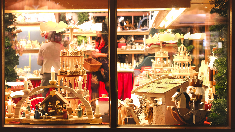
A store in downtown Montreal marks the spirit of the season each year with its Christmas display window. Merry-go-rounds, animated plush toys, dolls… when you go past you are immediately captured by the Christmas spirit. “With such a display window, this store must be filled with 1,001 treasures!”, one said. This visual experience attracts crowds, even after 70 years!
Measure
Some retailers have the bad habit of filling their display window with a variety of objects. But too much is as bad as not enough! Not only is it not visually attractive, but any surprise effect is removed. Luxury stores have a good understanding of this golden rule! Their display windows are always clean, with two or three outfits on display.
If a passer-by is attracted by just one of the offered items, they will say it’s worth a visit. So choose a centrepiece that you will enhance with decoration and that will make them want to see what else you have to offer.
Dare
Many brands change their decor with the seasons, but why not more often? After all, it only takes a bit of paint or new wallpaper. With this in mind, some stores go for large video screens that can change the projected images. By suggesting various visual experiences you will increase your chances of attracting new consumers. Loyal customers will see the winds of change and will want to visit you again.
However, like the Instagram feed of an influencer, there has to be a synergy in the colour and theme of the grouped products. Is the presentation visually attractive? Does everything blend together beautifully? Be creative and combine the colours! You may not catch the eye of passers-by every time, but you will be worth standing out!
Observe
Sometimes it’s enough to observe the behaviour of consumers to see that something is wrong with the arrangement. Are your customers always asking the same questions? Do they tend to look for or buy the same product? In this case, place your star products at the store entrance or in the display window and provide clear signage to help them find their way.
Knowing how to enhance products and arrange selling space is the art of understanding where consumers look!
